It was 9am at my desk. I took a screen I was working on for a pension product, and asked AI to "improve the copy." It came back in seconds, so polished and clean. The obedient agent improved it so much that it removed a critical sentence — one that assured users that their pension fund can't be moved without their explicit approval. Because why would users care about something like that?
It's the same thing I keep seeing everywhere right now.
Everyone is sprinting toward "more and faster" with AI. Content teams are shipping at a pace that would have been unthinkable two years ago. And the output looks... fine. It's polished, and grammatically correct, and uses all the right UX patterns.
Minor issue, though. It doesn’t do what it’s supposed to. It doesn't move users forward, reduce confusion, or build the kind of trust that makes someone feel safe entering their credit card number. It just... exists. Filling space. Looking professional.
And I kept thinking: "I’ve been here before." I recognize that tree. I've been watching it for years, actually. Just in a different industry. It’s what happens when you scale content faster than you scale judgment.

🫢 Spoiler: It’s localization 🔗
Localization teams have been dealing with this exact problem (scaling content without losing quality) for a very long time. They've been working with machine translation, managing thousands of strings across dozens of languages, and building systems to make sure nothing breaks when you're shipping at scale.
They've figured out, through years of painful trial and error, how to move fast without causing chaos. To use machines for production while keeping humans in the loop for judgment, and define "quality" in a way that's actually measurable.
UX writing teams are going through the exact same growing pains right now. Not identical (the details are different), but the pattern is the same. We’re pressured to produce more, faster, with automation involved, while somehow maintaining quality.
With AI, UX teams are experiencing the exact same growing pains that localization teams had to deal with for years. They're pressured to produce more content faster without losing quality
So I started pulling the thread. What can UX writers actually learn from the localization playbook💭
Turns out: quite a bit.
💭 What’s your Why? 🔗
This is the question missing from most workflows. Whenever I work with teams that are frustrated with their AI output, the conversation usually goes something like this:
"The AI keeps generating generic copy."
"What did you ask for?"
"...We told it to write a confirmation screen."
Right. And that's the problem. "Write a confirmation screen" is a task, not a goal. The AI did exactly what you asked: it wrote a confirmation screen. It doesn't know why that screen exists or what it's meant to achieve.
Localization teams learned this lesson early, because when you're sending a string to be translated into 30 languages, "just make it sound good" doesn't cut it. You have to specify: What is this string doing? What action should the user take after reading it? What's the emotional register? What are the constraints? Because without that context, you get 30 technically correct translations that are functionally useless.

So before we talk about frameworks or QA checklists, here's the foundational question:
What is your content meant to do? 🔗
✔️ Maybe the job is to get the user to the next step as fast as possible —minimal friction, maximum clarity. That's your checkout flow, your setup wizard, your "You're almost done" screen.
⚠️ Or reduce risk — payments, security, privacy, anything regulated. Here, accuracy and honesty outweigh friendliness every time.
🤝 But perhaps it’s to build trust — set expectations, explain why you're asking for something, reassure without overpromising.
👩🏻🏫 It could also be to teach — help a user understand a complex system they've never used before.
🛟 Possibly, it's to reduce support load — prevent the confusion that generates tickets.
🎁 Or (and this is valid too) the job is to create a pleasant experience. Delight. Warmth. Personality.
Pick one. Then everything else gets easier.
You do have to start with something. Otherwise, you end up with generic copy that does nothing. The AI is happy to write you a friendly, trustworthy, actionable, educational, delightful confirmation message
Turning the goal into something you can actually check 🔗
Once you know the job, something interesting happens: "quality" stops being a vibe and starts being something you can measure.
This sounds obvious, but think about how content review usually works in practice. Someone reads it. They go, "Hmm, I don't love the tone." Someone else says, "I think it's fine." A third person suggests making it "more human." Everyone has a slightly different definition of "good," and the conversation goes in circles until the most senior person in the room wins.
Localization teams can't afford this. When you're reviewing translations at scale, "I don't love the tone" doesn't help the translator in Japan or the reviewer in Brazil. You need specific, checkable criteria. So they define quality signals upfront:
- If the goal is fast action, the signals are: clarity, brevity, a strong next-step cue, no fluff. You can check each one. Did the user understand what to do? Was there anything unnecessary? Was the next step obvious?
- If we’re trying to grow trust, the signals are: accuracy, honesty, no overpromising, a calm and respectful tone, and clear boundaries. Again, checkable. Did the copy promise something the product can't deliver? Did it sound like a robot trying to be reassuring?
- If it’s delight we’re after, the signals are: personality, warmth, lightness (but still no ambiguity, because funny copy shouldn’t confuse people.)
See the pattern? The goal defines what "good" means. Without a goal, you're just arguing about taste. And taste doesn't scale.

Use the goal to guide AI — don't just review after the fact 🔗
In localization, we learned from experience that you need to provide context and information before the work happens. Screenshots, so the translator can see where the text appears. Character limits, so they don't write something that breaks the layout. A glossary, so they use the right terms. Tone guidelines, so they match the brand. Notes about the user's emotional state at this point in the flow.
All of this doesn’t exist because loc teams are type A (even though, you know… We are ?). But because they’ve learned, over years of expensive mistakes, that you can't review quality into a process. You have to build it in from the start.
Same principle applies to AI. If you want AI to produce content that actually works, the goal has to be part of the input:
- What is this content supposed to achieve?
- Where does the user see it? What's the screen, what's the state, what just happened?
- What terminology is required? What's forbidden?
- What claims are we allowed to make? What's off-limits?
- What does success look like?
The more context you provide upfront, the less you have to fix after. Localization teams have known this for decades. UX writing teams are just discovering it now.
🤔 Why now? 🔗
Let's zoom out a bit. Why are UX writing teams suddenly struggling with quality at scale?
Because the ground shifted. And it shifted in ways that localization teams will find very, very familiar.
(P.S. There are also solutions coming up, promise!)
Shift 1: Scale forces you to build content ops 🔗
There was a time, not that long ago, when UX copy was a handful of carefully crafted strings, written by one person, who maybe got it reviewed and maybe didn't.
That time is over. In any product of meaningful complexity, content is now a system. You have hundreds or thousands of strings, multiple surfaces, multiple user states, and multiple teams writing copy at the same time, sometimes for the same flow. You need organization, versioning, ownership, and some way to find "that error message we wrote for the billing screen six months ago."
Localization teams have lived in this world forever. Every release is many strings, multiplied by many languages, multiplied by many contexts. They had to build content management systems because without structure, nothing wouldn't ship correctly. UX writing is hitting the same wall, and the teams that don't build ops will drown in inconsistency.
Shift 2: You don't fully control production anymore 🔗
This is the big one. Localization has worked alongside machine translation for decades. Not happily, not always smoothly, but they've done it. They learned to accept partial automation and shift their effort toward guidance, review, and risk management. The machine does the heavy lifting. The human does the judgment.
UX writers are learning this lesson now, but for creating content. AI is now writing the original strings, and that means you are no longer the person who makes every sentence by hand.
It’s a fundamental shift in where your expertise matters. You're moving from craftsperson to editor, architect, quality controller... but your value is still in knowing which words are right.
Shift 3: Content has to fit into automated workflows 🔗
Localization was historically the bottleneck. "We can't ship until the translations are done." So loc teams did something smart: they built themselves into the pipeline. Strings are treated as artifacts, managed the same way you manage code.
This happened, obviously, because manual handoffs don’t scale. "Hey, can you review this doc? It's in the shared folder somewhere" — that doesn’t work when things need to happen so quickly.
UX writing is being pulled into this same reality. Content can't be the last-minute manual step that happens after design is "done." It needs to be part of the system: versioned, tracked, automated where possible, reviewed where necessary.
Automation, growing complexity, and a considerable shift in production agency are forcing UX writers to design QA-tracking systems that scale
Shift 4: Automation makes context and QA non-negotiable 🔗
When a human writes every sentence, you can rely (to some extent) on their judgment. They've seen the screen, know the product, and can make reasonable assumptions.
When a machine writes sentences, or when content moves through automated pipelines, none of those assumptions hold. The machine doesn't have judgment (not really). So you need to make the context explicit, and put the guardrails in place before production. You also need QA gates that catch problems systematically.
Localization teams have long implemented these: from pseudo-localization to QA steps, glossary enforcement, automated style checks, and more. All of it exists because "we'll review it later" doesn't work when you're shipping in 30 languages at once, and it doesn't work when AI is generating content for 30 screens at once, either.

✍️ The practices worth stealing 🔗
Okay. So the problems are similar. What about the solutions?
Here's what I'd take from the localization playbook and apply directly to UX content in the AI era.
Treat copy like a product asset 🔗
Localization teams assume every string will have to be reused, referenced, versioned, and audited, because it will be. UX copy should get the same treatment. If you can't find the copy you wrote six months ago, if you don't know which version is live, if there's no source of truth, you have a problem that will only get worse with AI in the mix.
Separate fluency from correctness 🔗
This is maybe the most important one. AI is fluent. That's what it's good at. It produces text that reads smoothly, sounds professional, and uses appropriate vocabulary, but fluency is not the same as correctness. A sentence can be perfectly fluent and completely wrong. It can sound confident while making a promise the product can't keep.
And the reverse is true too: something can be technically correct but still not fluent (awkward, stilted, or just not how people actually speak). That “correct-but-unnatural” copy can be just as damaging, because users have to work harder to parse it and that ends up eroding trust.
Make quality operational 🔗
This means: define the checks. Assign owners. Build gates. "Quality" can't live in one person's head or depend on whoever happens to review the PR. It needs to be a process that works even when your best writer is on vacation.
This also means you'll have to...
Build guardrails that scale 🔗
Just like localization teams maintain extensive glossaries and style guides per language, per market, and per brand, UX teams should maintain them per product, per flow and screen and state.
Design feedback loops 🔗
When a localization error makes it to production, a good loc team figures out why the system let it through and update the guidelines, the glossary, the review process, or the QA checks so it doesn't happen again. When AI-generated content fails in production, the same approach applies. You want to ask yourself: what's missing from the prompt, the guidelines, or the review process that allowed this🤓
🤓 Five checks before anything ships 🔗
Check 1: Is the meaning correct? 🔗
What to look for:
- Intent drift — did the AI "polish" away a crucial detail?
- False confidence - does the copy state something as fact that's actually uncertain?
- Hallucinated specifics - did the AI add numbers, timeframes, or promises that weren't in the brief?
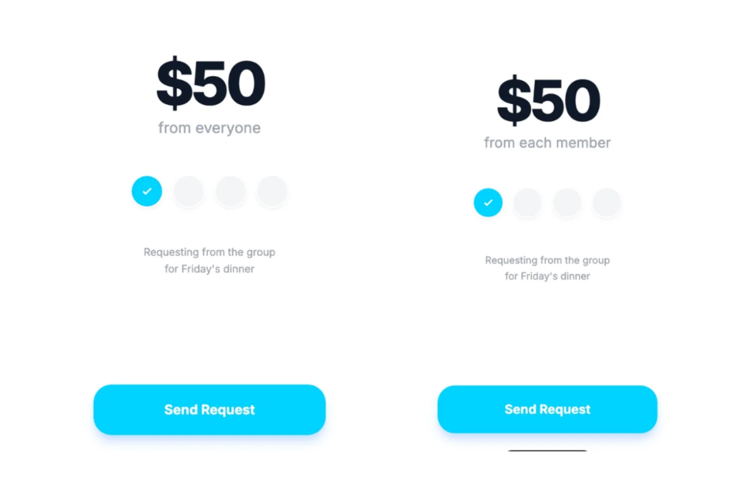
In a fintech flow I wrote recently, the users could request money from a group of people, but a tiny AI “fluency” tweak almost broke things. The intended instruction was for people to be able to choose the sum that’ll be requested of each group member (so 10 people means $500 total). But the rewrite “Charge $50 from everyone” was too vague, and sounded like the $50 was the total number. People would have, naturally, gotten confused.
Check 2: Does it drive the right next step? 🔗
What to look for:
- Is the next action obvious? Can the user tell what to do without thinking?
- Is there ambiguity? Could "Submit" mean two different things in this context?
- Is there a dead end?
Look at the two versions of this travel app empty state. The version on the left is poetic, sure, but the user is left floating. The version on the right is clear, inviting, and the button says exactly what to do.

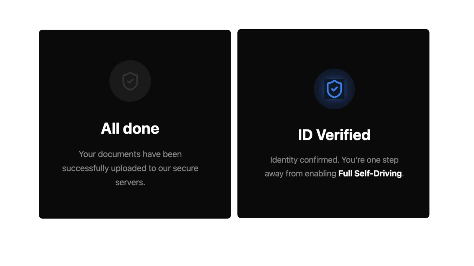
Check 3: Does it build trust (or at least not damage it)? 🔗
What to look for:
- Overpromising
- Robotic reassurance — "We apologize for the inconvenience" (nobody feels better reading this)
- Patronizing tone — "Don't worry!" (I wasn't worried until you told me not to worry)
- Missing accountability — something went wrong and the copy doesn't acknowledge it
Look how the version on the left tries to soothe with generic reassurance, but it feels corporate and bland. While the one on the right candidly states what happened in plain language, sets expectations for what is next, and gives the user a clear, doable action.

Check 4: Does it fit the context? 🔗
Users don't read copy in a vacuum. They read it mid-task, mid-frustration, mid-decision... The screen, the user's state, what just happened, what's about to happen: all of that shapes whether copy lands or falls flat.
What to look for:
- Screen mismatch — the tone is wrong or the wording isn’t specific enough
- State blindness — the copy assumes things about the user that aren’t correct
- Cultural assumptions — the copy uses idioms, date formats, or references that don't travel
Notice how the screen on the left could be plonked literally anywhere, but the one on the right is fully immersed in the flow (and it helps users place themselves within that context).
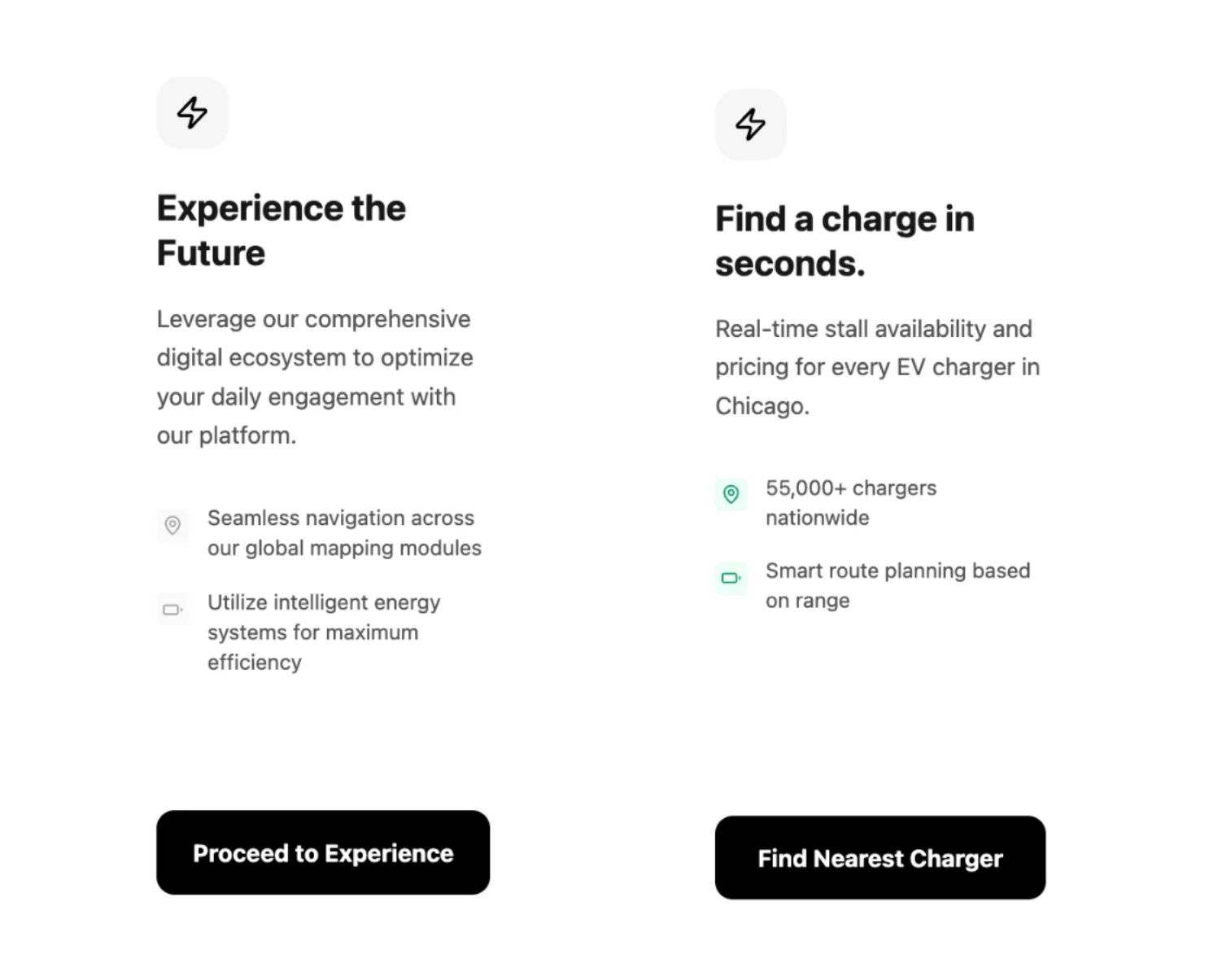
Check 5: Does the user understand why they should care? 🔗
AI defaults to company-facing language because that's what most of its training data looks like. It usually feeds from marketing pages, press releases, and feature announcements, so it produces copy that talks about the product instead of talking to the user.
Look at these two screens for an EV charging app. On the left, it’s the company admiring itself in the mirror. Not a single word answers the user's actual question: "Where can I charge my car?" But on the right, every line is about what the user gets.
👩🏻💻 How to actually do this (starting tomorrow morning) 🔗
I'm not going to pretend this is a weekend project. Building a real quality system takes time. But to start seeing results, you just need a few things in place, and you need to be willing to iterate.
Here's the minimum viable version:
1. Write down the goal for each screen 🔗
Yes, just add a line in the spec doc: "The checkout confirmation screen's job is to reassure the user that payment went through and tell them what happens next." That's the brief.
2. Create a short do/don't list 🔗
What your content should always do (always name the next step, never promise specific timelines unless confirmed). What it should never do (no exclamation marks in error messages, no "we" in legal contexts, no superlatives without proof). Keep it short so you can manage it.
3. Set up a glossary 🔗
In the same way that it's used in localization, it should contain your core terms that have to stay consistent across every screen, every language, and every AI-generated variation.
4. Add one QA step 🔗
Before any AI-generated copy ships, one person runs the five checks.
5. Start a failure log 🔗
When something makes it to production that shouldn't have, write down what broke. Was the goal unclear? Perhaps a glossary term was missing? Did the prompt lack context? Update the guidelines, the glossary, or the prompt accordingly.
That's the starter kit. And I promise you: it’s going to be the first step in an extremely valuable journey.